Creative Strategy Alternatives
Blackberry’s current positioning strategy is focusing on end benefits, product attributes, use and application such as functionality which includes big screen, physical keyboard and therefore easy typing experience. Blackberry’s advertisements are usually focused on these attributes. According to reviews, “Passport” scored high on functionality attributes and moderately on design and other factors (such as brand equity). Here, we briefly review the company’s alternatives for its’ creative strategy.
Smartphone market is a mature market and competition is intense. Therefore, generic strategy would not work as Blackberry cannot adequately differentiate its products from competitors'.
Pre-emptive strategy would not work either as smartphone market is a well-developed and growing market and products can be differentiated from each other in many different ways, such as physical attributes, user experience, functionality, etc.
Blackberry has widely used Unique Selling Proposition strategy in the past. For instance, it has focused on the benefit of the products such as fast browsing and connectivity in its’ advertisements. Using USP makes sense as smartphone is a well developed product category with high technological level.
 |
| An example of Blackberry using USP |
 |
| Another
example of Blackberry using USP |
Brand Image strategy was particularly used by Blackberry in its heydays when Blackberry was treated as a trademark. The “Be Bold” campaign is a good example. Not much information is provided in the ad and the Blackberry’s logo is very pronounced in the black background. The focus is on the psychological benefits that customers will receive by following the fashion trend and buying a then-stylish Blackberry. This strategy is not viable today as Blackberry has ever-since lost its brand equity.
 |
An example of
Blackberry using Brand Image strategy in its’ heydays
|
Later on we will see that Blackberry’s current creative strategy is Positioning Strategy which is believed to be the best strategy to attack a market leader through direct comparison advertisement.
Current Creative Strategy
Upon launching Passport, Blackberry has adopted a different creative strategy compare to its previous strategies. The ads are unique in their nature, and effectively communicate the message with the target market in a matter of seconds.
Blackberry has managed to address its marketing communication issues- such as its’ unfocused target market, its’ focus on functionality or style dilemma, it’s dilemma regarding the orientation of the advertisements and whether they should be "informative" or create a positive “feeling”, etc- all by clearly demonstrating which target market they are aiming for. As mentioned in the last part, they are currently targeting the professional sector who value functionality above anything else. The ads score high on the relevance. They capture the target audience’s attention instantly through the pictures, and generate critical brand associations through specific cognitive response (rather than emotional response). Blackberry ads’ relevance is aligned with and support the brand positioning strategy. (See the below picture)
The novel characteristic of the ads is the comparison it makes between a smaller smartphone and Blackberry’s new smartphone, Passport. In an amusing and memorable way, they demonstrate the limitations of the smaller device. The ads are highly visual; however, they are simultaneously informative too. No other smartphone brand has ever differentiated itself on having a bigger size and the visual benefits that come with it. In the past, this desired product attribute has been usually associated with the tablet market and smartphone manufacturers were often focused on offering thinner and more delicate devices than competitors'.


 |
| Blackberry’s current ads for “Passport” |
Passport is one of the largest smartphones in the market. The message that “seeing the bigger picture is beneficial” is easy to digest and specific to the target market. The ads keep a balance between visual creativity and message delivery and because of that, the message easily breaks through the clutter. The idea behind the ads is novel but yet does not require long consumer processing time. It engages the audience by inviting them to make a comparison between the two devices and make a decision on which one is better.
Massage Appeals:
In the last report, it was established that Blackberry’s target market constitutes mostly enterprise users and that the consumers can be categorized as favourable brand switchers. For Blackberry to encourage these smartphone users to try the device, it needs to be clear on how and why consumers would be wanting to purchase the product. It needs to either satisfy users’ current needs or create a need that can be satisfied by the product attributes. The main consumers’ need that is addressed by Blackberry Passport include:
- Seeing the bigger picture: Blackberry’s current slogan is “see the bigger picture”. It cleverly indicates the key benefit of the product- the wide screen- and differentiates the product from smaller smartphones on the productivity level and therefore, evokes positive feeling towards the brand. For instance, a one minute video ad of Blackberry shows some serious looking 30 to 50 year old professionals that use Passport to make business decisions and a healthcare professional that diagnoses a serious disease of a patient in an emergency situation by seeing the full x-ray picture on his Passport.[1]
The creative theme for Blackberry, as mentioned before, has not always been consistent across all parts of the promotional program. Slogans that the company have used in the past include “Get closer, get smarter”, “Now, fashion and function play nice” and “Some customers will need more than just one”. This inconsistency reflects the lack of clarity in brand positioning strategy that Blackberry struggled with in the past.
Blackberry's ads practice rational appeal and more specifically, comparative appeal. The smartphone next to Passport in the ads resembles an average smartphone in the market, but “coincidentally” it also looks almost identical to iPhone and Samsung Galaxy, two of Blackberry’s biggest competitors. The comparative message is quit literal. Studies show that recall rate is higher for comparative than non-comparative messages. The ad engages iPhone and other smartphone users as they try to figure out why there is a picture of their phone in a Blackberry ad. iPhone’s size was an easy attribute to attack. No counter-argument can be made against Blackberry Passport being bigger than iPhone. Had Blackberry attacked other features of Apple’s products (such as security, stylishness and design, brand, etc), iPhone-users would have taken the advertiser’s claims with a pinch of salt. This would have lessened the credibility and therefore likability of the ad.
I noticed a connection between this ad and Blackberry’s current promotional efforts to sell Passport. Blackberry is offering iPhone users $400 cash prize and $150 gift card in exchange of them giving up their beloved iPhone and switch to Blackberry Passport. (Hansen, 2014) This might be over the top but it can be justified as Passport is in the introduction stage of the product life cycle and needs help to penetrate the market -unlike Apple which has reached maturity to my opinion.
Copywriting Highlights:
Blackberry's new ads have a relatively consistent layout. The headline of the ads- “Examine Wide”, “Go Wide”, “Work Wide”- however short, is strong enough to give clues about the main theme, appeal and proposition of the ad. The comparative ads are highly visual rather than verbal. Very few words are used in these ads with basically no body copy. However, in non-comparative ads for Passport, more information is provided about the product and the brand is typed in a much larger font-size. The small font-size of the brand in the comparative ads reinforce the fact that Blackberry is a recovering brand and rather position itself by the end benefits of its product than by its’ brand name. Blackberry’s brand has been damaged in the past few years; it has lost its brand recognition to some extent. The last thing that Blackberry should do is to try to differentiate itself based on its' brand in comparative-style ads.
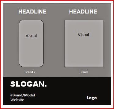 |
| The layout of Passport’s current print ads in magazines and newspapers |
Blackberry’s choice of colour, font type, font size and position of the logo was different prior to the launch of Passport and has evolved throughout the years.
 |
| Blackberry ads used to have a different layout prior to Passport |
[1] https://www.youtube.com/watch?v=XnzLBn0TzBg
References:
Hansen, Matt. 2014. Blackberry is paying iPhone users to switch to the Passport. TechRadar Phones. Retrieved from: http://www.techradar.com/news/phone-and-communications/mobile-phones/blackberry-is-paying-iphone-users-to-switch-to-the-passport-1274490
No comments:
Post a Comment